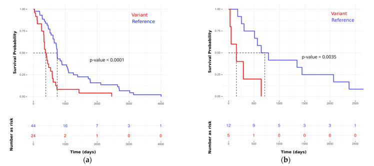
Figure 5.
Kaplan–Meier plots for best variants (rs6728689 in SP100) show a high association with poor prognosis in rPDAC. The y-axis represents survival probability, and the x-axis represents the survival time in days. The vertical dotted lines represent the median of survival (survival probability of 0.5) in each group. (a) Using the training set; (b) using the independent test set.

