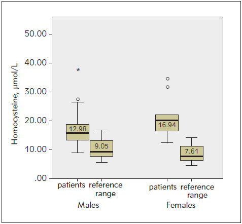
Figure 1. Comparison of homocysteine level with reference ranges for male and female patients. The graphs show the scatter of the results within the group. The thick black line in the middle is the median, inside the coloured area are the results between 25% (lower edge) and 75% (upper edge of the rectangle), i.e. 50% of all results, while the horizontal end lines indicate the range of results covering the largest and smallest results. They do not go beyond the framework of distribution (they are not outliers or extreme results). (p<0.001 one-sample t-test).

