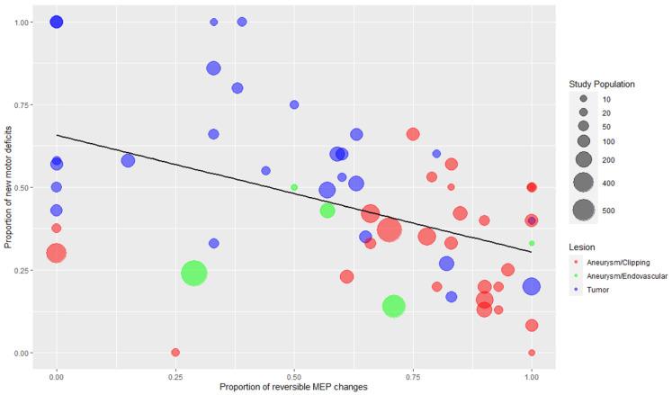
Figure 4.
Bubble plot with regression line depicting the negative correlation between the proportion of reversible MEP changes and proportion of new motor deficits associated with MEP changes. Each dot represents one study, and the color corresponds to the type of the lesion (blue: tumor, red: aneurysm/clipping, green: aneurysm/endovascular procedures). The two studies of epilepsy surgery are depicted together with tumors (blue color). The third dimension added is the study population size, which is displayed by the size of each dot. Spearman’s rank correlation coefficient = −0.498 (p < 0.001).

