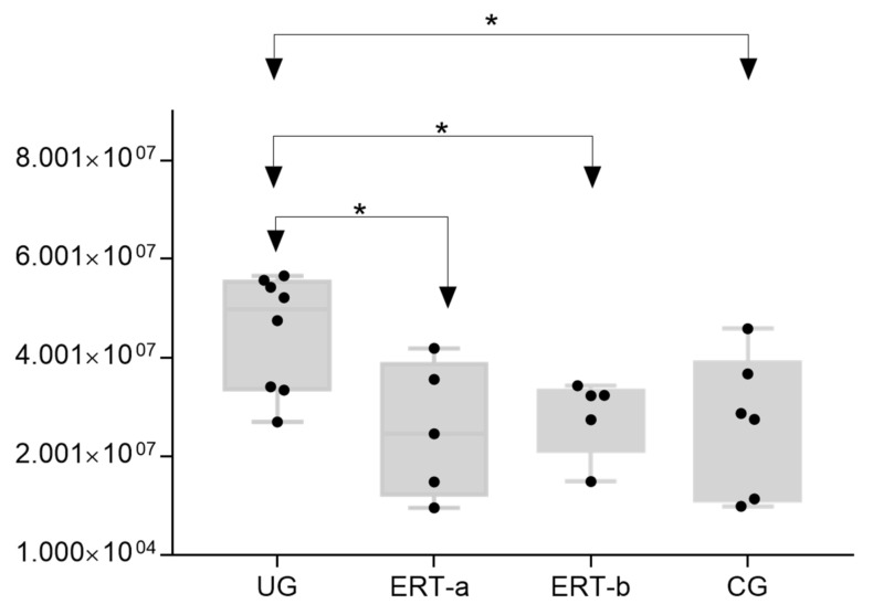
Figure 13.
Box plot depicting ATA1 levels in each of the study groups. Each data point represents the median value obtained in an individual sample. The line inside the box represents the median of all values obtained. The upper and lower limits of the box represent the first and third quartiles. Whiskers represent the minimum and maximum values within 1.5 times the interquartile range. Any data points not included between the whiskers are considered outliers. * p < 0.05.

