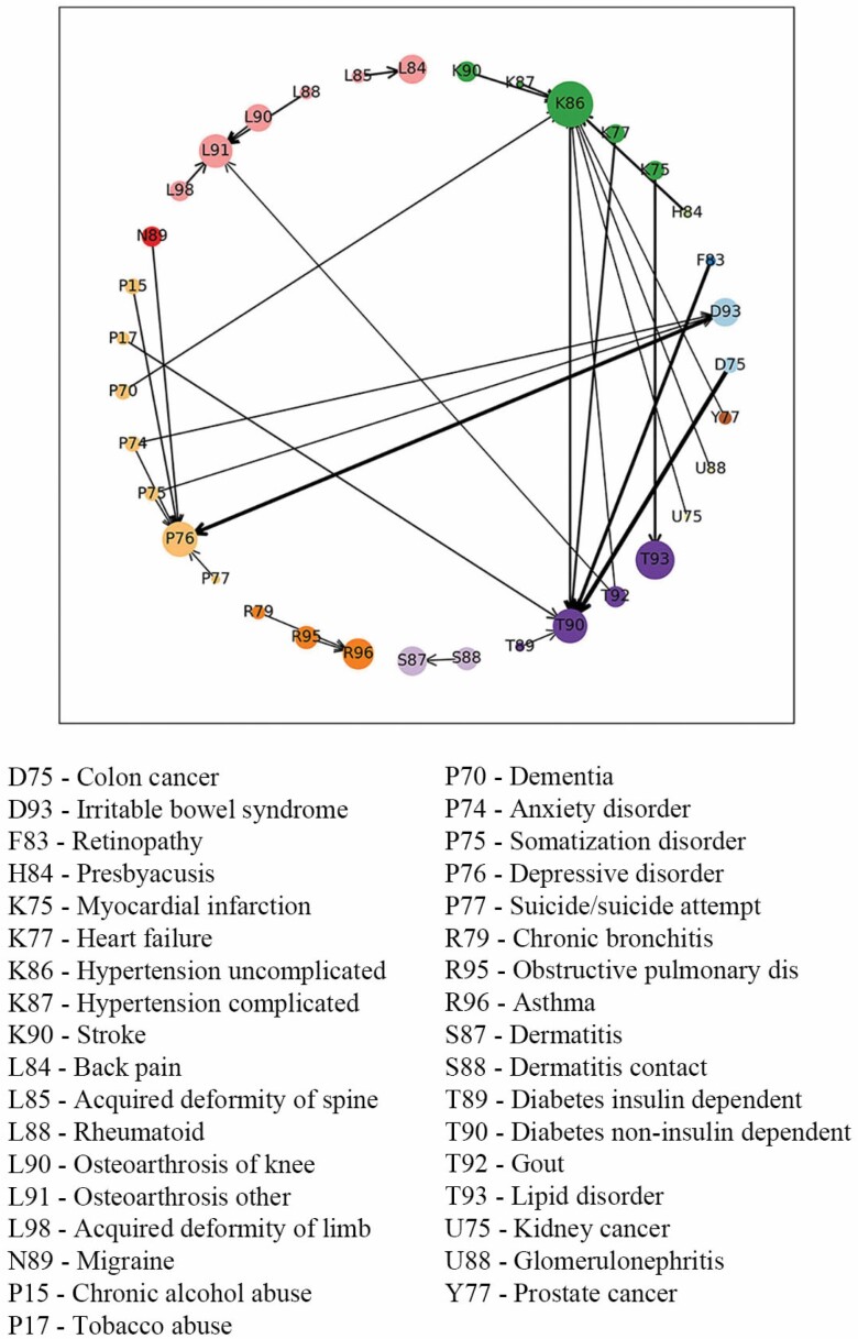
Figure 2.
Visualization of Weighted Association Rules Mining results. The color of the nodes stands for the disease group and the size of the nodes is determined by the frequency of the occurrence of the condition. The arrows on the edge show the direction of the relation and wider edges imply that the associations were closer and stronger.

