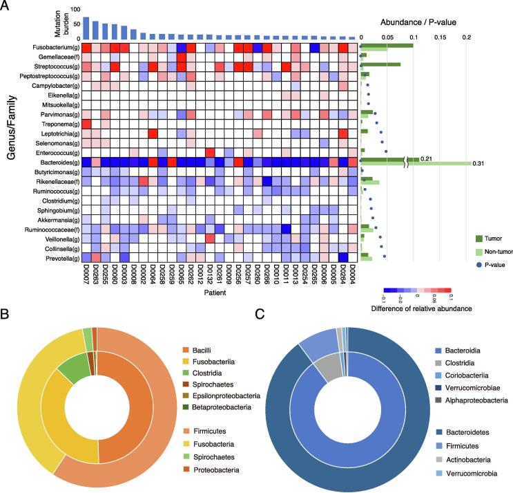
Fig. 1.
Differences between tumor and non-tumor-enriched taxa. (A) Heatmap shows difference between the relative abundance of each genus in tumor and non-tumor tissues. When the relative abundance in tumors is greater or lesser than in non-tumor samples, the cells are shown in red or blue, respectively. Genera positively enriched in tumor tissue and non-tumor tissue (P < 0.05, Wilcoxon rank sum test, one-sided) were extracted. The averages of the relative abundances are shown as a bar chart in the right of the figure. The green bars indicate the abundance in tumor tissue, and the rig green bars indicate the abundance in non-tumor tissue. The p-values are also indicated as circles in the chart. Distributions for the taxa are shown in (A) enriched in tumor tissue (Fusobacterium(g) – Enterococcus(g)), and (B) enriched in non-tumor tissue (Bacteroides(g) – Prevotella(g)). The same are shown in (C) as a pie chart. Outer circle indicates phylum level and inner circle indicates class level distributions. (For interpretation of the references to colour in this figure legend, the reader is referred to the web version of this article.)

