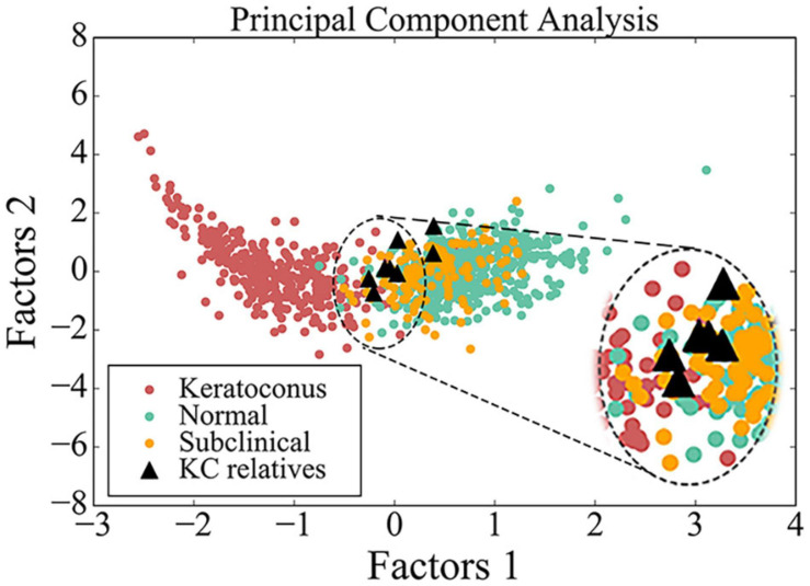
FIGURE 3.
Scatter diagram of data from BAD maps in different groups by principal component analysis. Red circle indicates data from patient with keratoconus, green circle indicates data from control, yellow circle indicates data from subclinical one, and black triangle indicates data from the asymptomatic parent with variant in this study. The image in the upper right corner is a larger image of the dotted line area.

