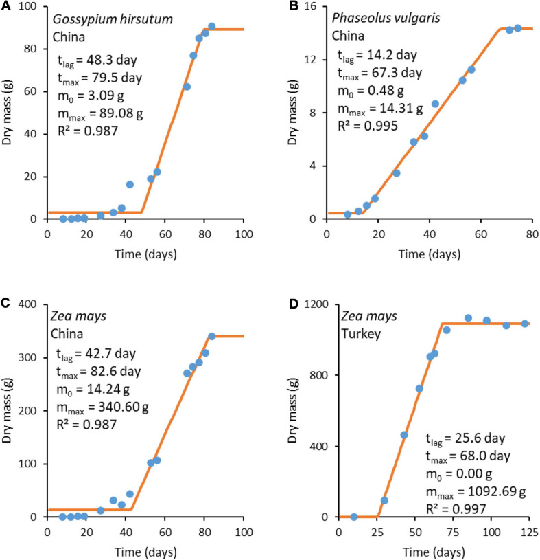
FIGURE 3.
Plant growth curves. The blue circles ( ) represent experimental data, while the orange lines (
 ) represent a fit made with the three-phase linear model (Equation 25). Experimental data sources: (A–C) from Shi et al. (2013) and (D) from Koca and Erekul (2016).

