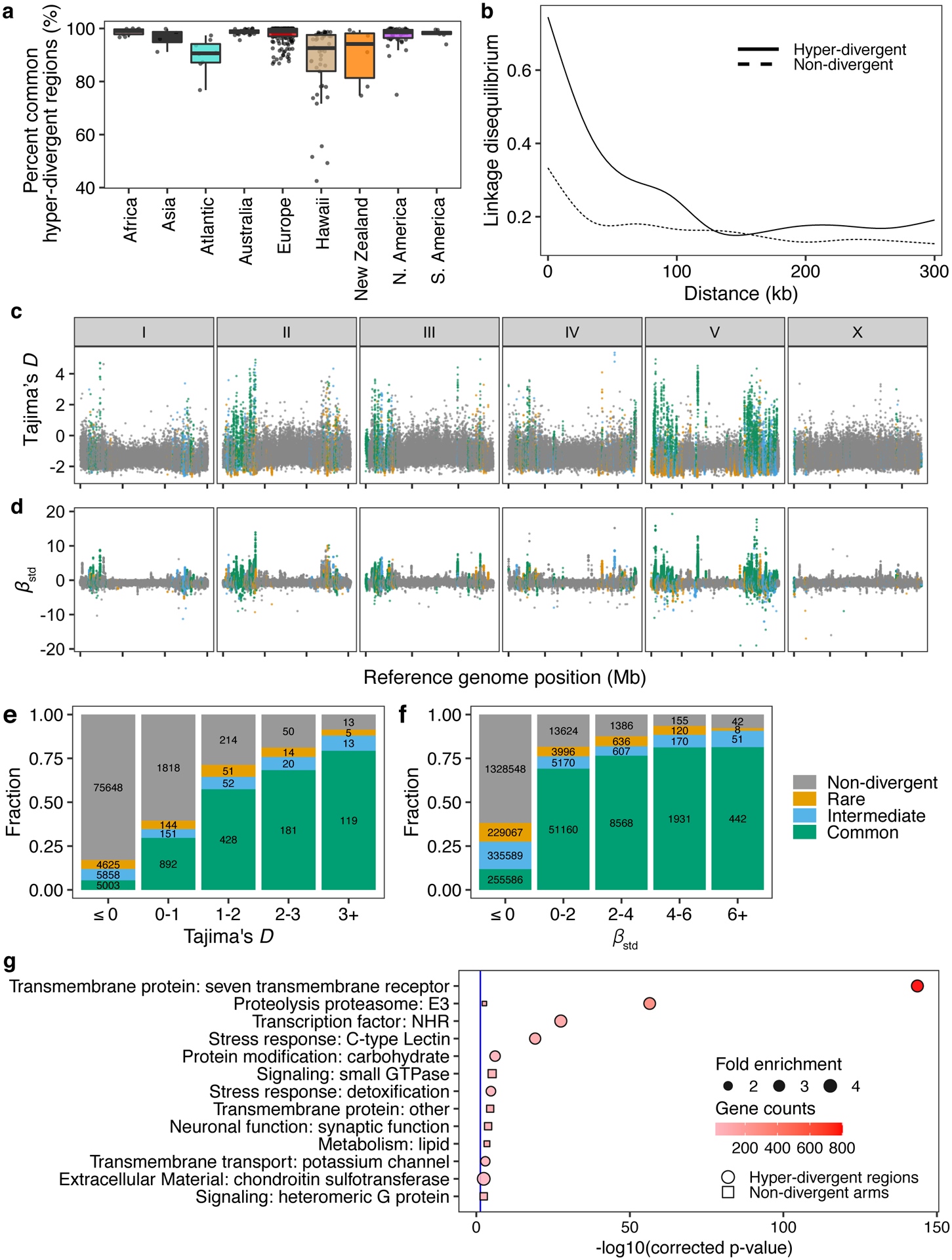
Fig. 4 |. Balancing selection has maintained hyper-divergent haplotypes enriched in environmental-response genes.

(a) Tukey box plots of the total amount of genome covered by common hyper-divergent regions are shown with data points plotted behind. Isotypes are grouped by their geographic origin. Each point corresponds to one of the 327 non-reference isotypes. The horizontal line in the middle of the box is the median, and the box denotes the 25th to 75th quantiles. The vertical line represents the 1.5x interquartile range.
(b) Linkage disequilibrium (LD) decay in non-divergent and hyper-divergent regions in autosomal arms is shown. Note that 99.9% confidence intervals are represented around each smoothed line (generalized additive model fitting) as grey bands, but not visible because of the narrow range of the intervals. Distances between SNVs are shown on the x-axis, and LD statistics (r2) are shown on the y-axis.
(c) The genome-wide pattern of Tajima’s D is shown. Each point represents a non-overlapping 1 kb genomic region and is colored by its divergent classification, (non-divergent region (gray), rare (<1%, orange), intermediate (≥1% and <5%, blue), or common (≥ 5%, green) hyper-divergent region).
(d) The genome-wide pattern of standardized beta statistics is shown. Each dot corresponds to the value for a particular variant, colored by its location, as (c). (c,d) The reference genome position in Mb is plotted on the x-axis, and each tick represents 5 Mb of the chromosome.
(e,f) Stacked bar plots for fractions of genomic bins (1 kb) for Tajima’s D (e) or fractions of variants for standardized beta (f) are shown. Genomic bins and variants are grouped and colored by their location same as (c). Numbers in bar plots represent counts of genomic bins (e) or variants (f).
(g) Gene-set enrichment for autosomal arm regions (square) and hyper-divergent regions (circle) are shown. Bonferroni-corrected significance values for gene-set enrichment are shown on the x-axis. Sizes of squares and circles correspond to the fold enrichment of the annotation, and colors of square and circle correspond to the gene counts of the annotation. The blue line shows the Bonferroni-corrected significance threshold (corrected p-value = 0.05).
