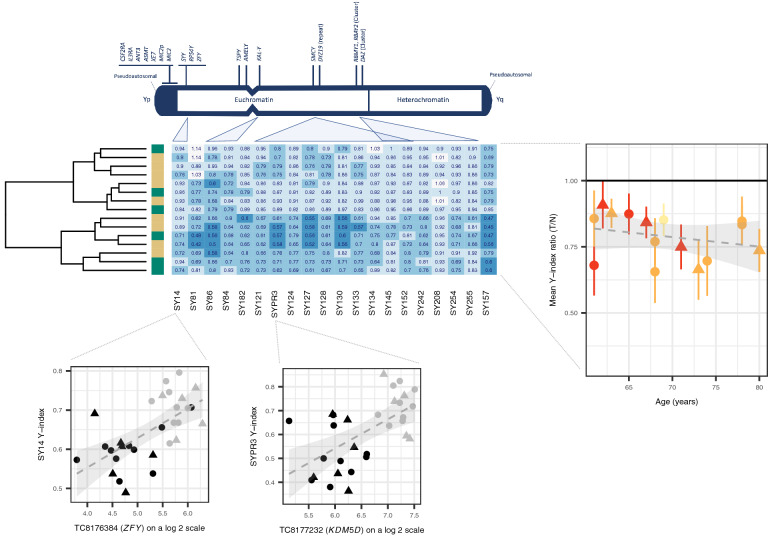
Figure 2.
Validation of Loss of Y. Figure is headed with a cartoon adapted from the Promega technical manual depicting sites on chromosome Y interrogated through PCR. A heatmap details the ratios between tumour (T) and histologically normal (N) amplification signals on a patient-by-patient basis. Histology is shown as a y axis sidebar (LUAD = beige, LUSC = green). The grand mean and standard deviation of these ratios across all sites is plotted against age as expressed in years and coloured by smoking history (never smoker = yellow, ex-smoker = orange, current smoker = red). A hatched linear smooth line is shown with its 95% confidence intervals shaded in grey. The relationship between amplification signal (the Y-index, presented on the y axis) and the expression of genes in the same region (presented on the x axis) are shown below, with individual points coloured by tissue class (tumour = black, histologically normal = grey) and including a hatched linear smooth line with 95% confidence intervals shaded in grey. Tumour histology is denoted by point shape (LUAD = circle, LUSC = triangle).

