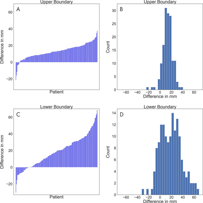
Figure 5:
A, C, Waterfall plots and, B, C, histograms show the differences between the software-generated scan ranges and the ground truth scan ranges for each patient. A positive difference indicates that the generated scan range was longer. A, The differences at the upper boundary were sorted and plotted as bars. B, The differences at the upper boundary were plotted by counts with a bin width of 2 mm. C, The differences at the lower boundary were sorted and plotted as bars. D, The differences at the lower boundary were plotted by counts with a bin width of 2 mm.

