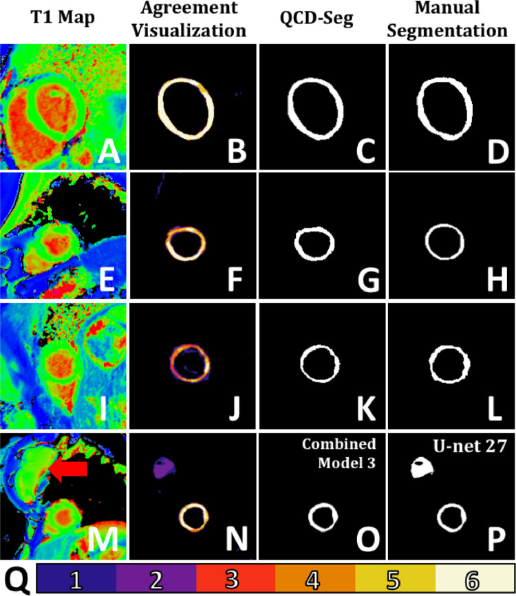
Fig. 2.
Examples of T1 maps, agreement visualizations, and segmentations. (A-D) The top row is an example in which there was high agreement among segmentation models, as shown in (B) the agreement visualization. Hence, the predicted DSC of the QCD output (C) was high (0.8933), which was consistent with the DSC (0.8996). (E-H) The second row is an example in which there was some disagreement among the segmentation models, as shown in (F) the agreement visualization. Hence, the predicted DSC of the QCD output (G) was low (0.6550), which was consistent with the DSC (0.6425). (I-L) The third row is an example in which the agreement visualization (J) showed high disagreement among the segmentation models, possibly due to the heavy wraparound artefact. The predicted DSC was low (0.5404) due to the disagreement despite that the DSC was much higher (0.7912). In clinical practice, this T1 map (I) should be treated with caution. Thus, a lower predicted DSC can serve as a useful alert. (M-P) The last row shows an example in which (P) the deepest single neural network (U-net 27) falsely classified the breast implant (red arrow in M) as part of the myocardium. On the other hand, (O) Combined Model 3 produced more robust segmentation. (Q) is a color bar which indicates the degree of agreement in the visualizations, with 1 being the lowest agreement to 6 being the highest agreement. (For interpretation of the references to colour in this figure legend, the reader is referred to the web version of this article.)

