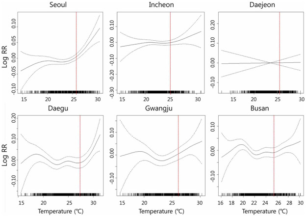
FIGURE 2 ∣. Penalized regression splines for all-cause mortality on daily mean temperature for summer (June to September in 2001–2008).
Each figure shows the spline curve (the solid line) with a 95% confidence interval (dashed line); In each graph, X-axis indicates temperature (°C) and Y-axis indicates temperature-mortality relative risk (RR); Vertical dotted lines indicate 75th percentile of temperature for each city.

