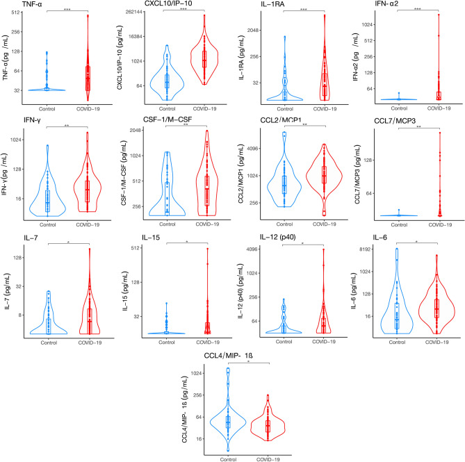
Figure 1.
Cytokine expression of COVID19 and control patients. The curved line of the violin box plots show the density of day 1 of hospital admission cytokine expression levels. The horizontal line in the inner box plot represents the median and interquartile range. Each dot represents a subject (COVID19, n = 90; Control, n = 51). Significance of comparisons were determined by an unadjusted linear regression models using log-scaled cytokines and robust standard errors. P-values after adjustment for multiple comparisons accompany the respective comparisons. *p < 0.05, **p < 0.01, ***p < 0.001.

