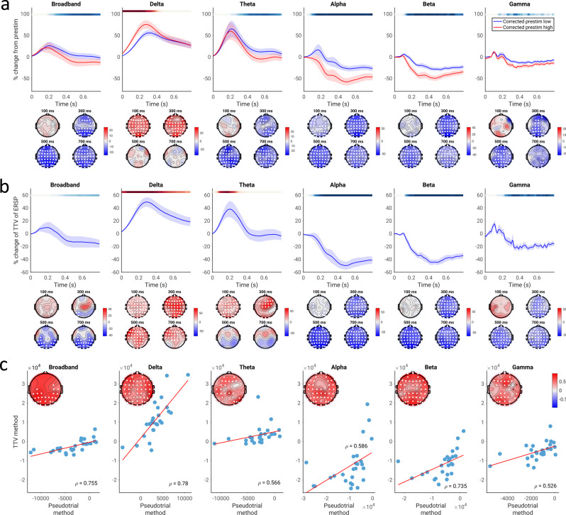
Fig. 6. Correlation of spontaneous and evoked spectral power in the replication EEG dataset (equivalent to Fig. 2 for the main dataset).
a Pseudotrial-corrected time courses for high prestimulus (red) and low prestimulus (blue) conditions. Line shows mean across all sensors and subjects, shaded area indicates standard error of the channel-average time course across subjects. Effect topographies are shown at 100 ms, 300 ms, 500 ms, and 700 ms; white dots indicate sensors which are part of a significant cluster. Shaded overbars indicate the significance of the difference between prestim high and low conditions. The shade of the bar indicates the percent of sensors which are part of a significant cluster at any given time point (i.e., darkest = all sensors part of cluster, lightest/white = no sensors part of cluster); red indicates positive clusters (prestim high > prestim low), blue indicates negative clusters. b Time course of TTV in each frequency band, expressed in terms of percent change from prestimulus levels. Lines, overbars, and topographies as in a: red overbars indicate clusters with TTV increases, blue overbars indicate TTV decreases. c Across-subject correlation of the two methods. Scatter plots show the correlation of the mean values of the summary indices across all electrodes, while the topoplots show the correlations at each electrode, with white dots indicating significance following the cluster test. N = 22 participants.

