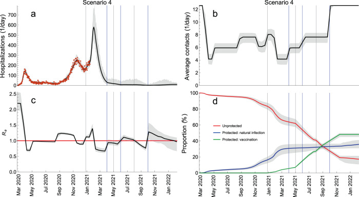
Fig. 7. Sequential relaxation of control measures.
This scenario consists of sequential relaxation of measures so that the contact rates increase, in sequence, to the level of June–August 2020, of September–October 2020 and the pre-pandemic level. The blue vertical lines indicate the mid-points of these transitions (1 April, 1 June, 1 October). The gray vertical lines indicate the starting dates for different vaccination phases (Table 1). The red horizontal line denotes Re = 1. The hospitalization data are shown as red dots. The thick solid lines are the median trajectories estimated from the model. The gray shaded regions correspond to 95% credible intervals.

