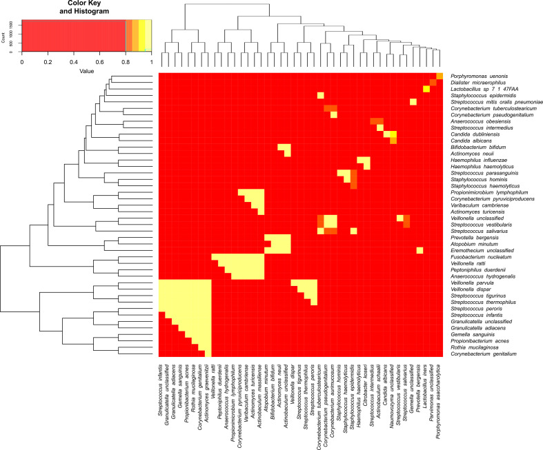
Fig. 4.
Top Spearman correlations for taxa pairs. Each interaction between a row and a column in this heatmap represents the Spearman correlation between the two taxa involved. Rows and columns are the different taxa ordered according to hierarchical clustering. For readability, only the top correlations were selected. Yellow colours indicate correlations closer to 1, while red colours imply lower correlations.

