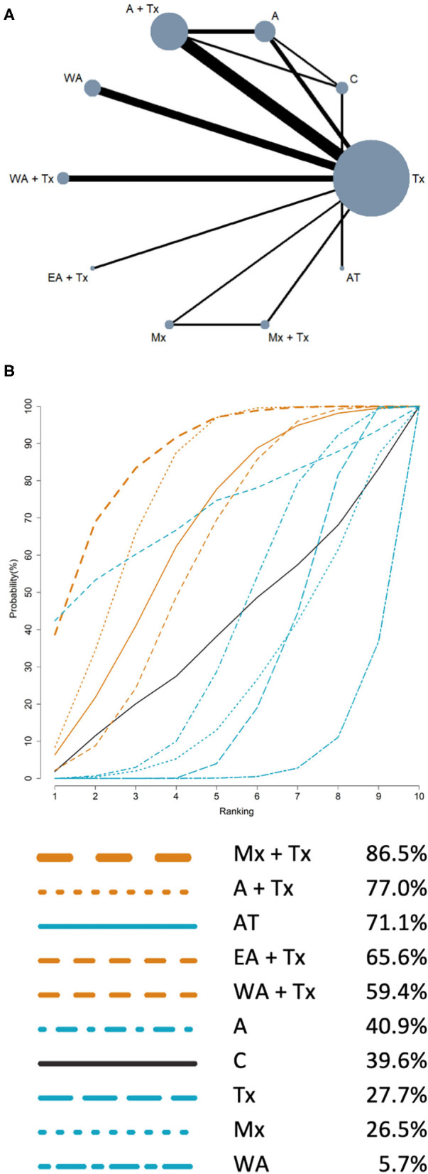
Figure 3.

Network meta-analysis results of FEV1% predicted: (A) Network plot; (B) SUCRA. (A) Network plot: the size of the nodes corresponds to the number of studies of each treatment. The lines between nodes represent direct comparison of the trials, and the thickness of the line linked between nodes corresponds to the number of trials included. (B) SUCRA: plot of the surface under the cumulative ranking curves. The larger the area under the curve means the higher the ranking. Ranking indicates the probability to be the best treatment (line color: orange: acupuncture point stimulation treatment combined with conventional treatment; blue: single intervention; black: control).
