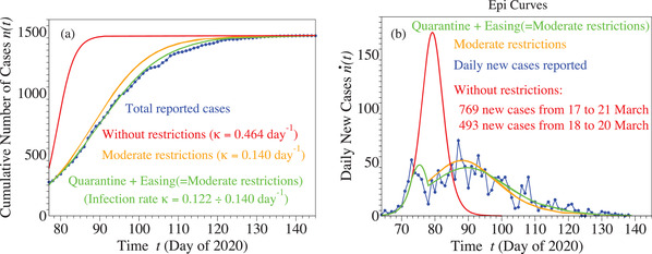
Figure 3.

Curves for cumulative (panel (a)) and daily (panel (b)) number of cases based on epidemiological reports and simulated as described in the main text. Notice that the first peak around does not represent a spurious effect of fluctuations. It is a real effect reproduced by numerical simulation (green curve), which nicely demonstrates how restrictive measures enforced stopped the explosive (unrestricted) evolution depicted in red. The orange curves depict results that could have been achieved if, instead of severe lockdown, the much milder restrictions effective on 20 April were imposed starting 20 March.
