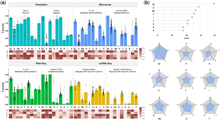
Fig. 2.
Overall performance of QUBIC2. (a) Bar plot: Distribution of f-scores on each of the eight datasets under multiple runs (with at least 50 parameter combinations). Bars denote the median of the dots. Q2, E, Bic, R, F, Q, B, I and P represent QUBIC2, EBIC, BicMix, Runibic, FABIA, QUBIC, Bimax, ISA and Plaid, respectively; Heatmap: Relative performance of six algorithms regarding d, v, p and r, respectively (normalized over six algorithms). Note that v depends on the increment of parameters and therefore is only indicative; (b) Lollipop plot: Overall scores of each algorithm summed across eight datasets; Spider plot: averaged scores of each algorithm in terms of f, d, v, p, r

