
Figure 4.
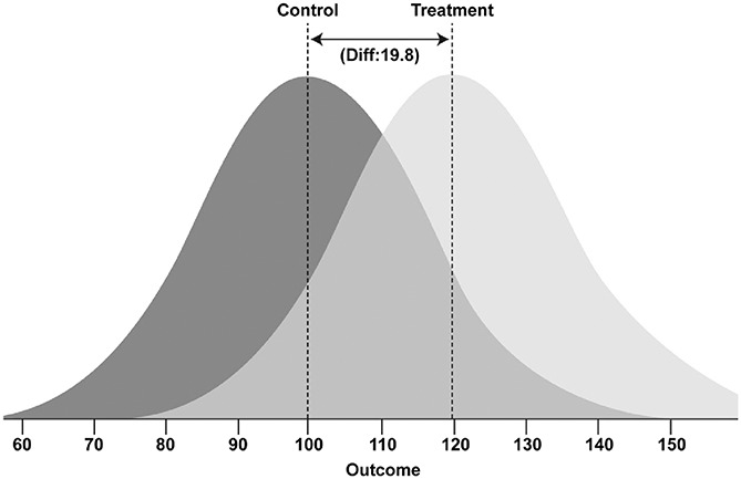
Visualisation of the overlap between control and treatment group distributions of the overall SMD effect size of 1.32.34 The darker distribution curve represents the control group and the lighter distribution curve represents the treatment group. Animals within each group can fall anywhere within their respective curves, with increasing likelihood towards the peak; imagine each curve a hill of animals with single animals at the tail-ends of the distribution curve. SMD, standardised mean difference.