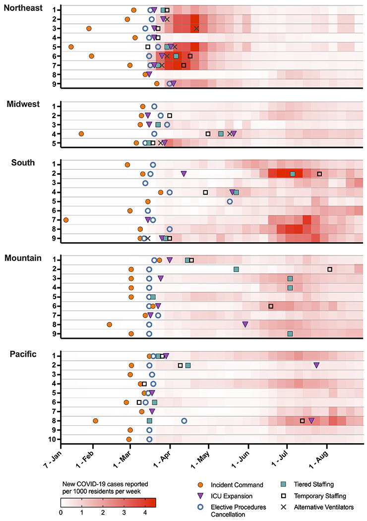
Figure 2: Hospital operational changes from January to August 2020, matched with county-level COVID-19 case rates.

Timing of hospital operational changes varied over the course of the first eight months of the pandemic, with regional variability. The red shading represents the rate of county-level COVID-19 cases per 1000 residents per week, matched to the county of each hospital. Overlying this heat map are six operational changes which show significant similarities across sites (e.g., elective procedure cancellation, [blue open circle]) and heterogeneity both pre-surge (e.g., incident command system activation, [orange solid circle]) and during the rise in cases (e.g., ICU expansion, [purple triangle]; tiered staffing models, [green solid square]; temporary staffing, [black open square]; alternative ventilator usage, [gray cross]). (Three hospitals had incomplete data for these changes).
