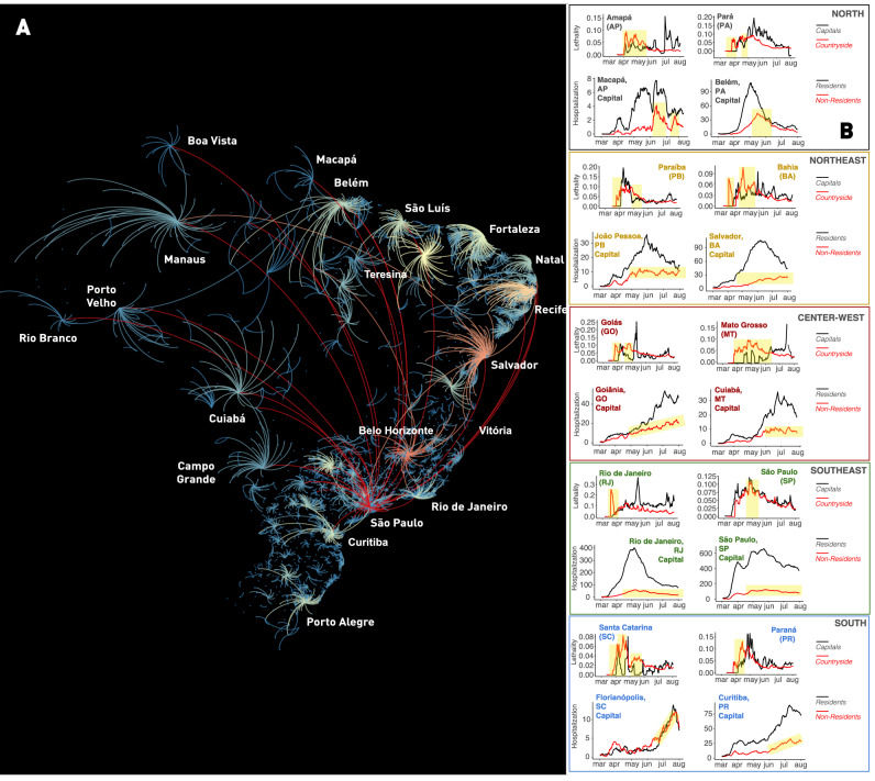
Figure 3.
Quantification of the Brazilian “boomerang effect”. (A) Representation of all “boomerangs” that occurred around major Brazilian state capitals (see labels for names) and mid-size cities across the whole country. In this map, arcs represent the flow of people from the interior towards the capital. The arc color code represents the number of interior cities that sent severely ill patients to be admitted in hospitals in a capital or mid-size town; red being the highest number of locations, orange and yellow next, while a smaller number of locations are represented in light blue. Most of the flow of people represented in this graph took place through highways. Red arcs likely represent long-distance flow by airplanes. In the Amazon, most of the flow of people towards Manaus occurred by boats through the Amazon river and its tributaries. Notice that again São Paulo appears as the city with the highest boomerang effect, followed by Belo Horizonte, Recife, Salvador, Fortaleza, and Teresina. (B) Lethality and hospitalization data, divided for capital and interior (for lethality) and capital resident and non-resident (hospitalization), for a sample of state capitals in all five regions of Brazil. Yellow shading in the lethality graphs represent periods in which more deaths occurred in the interior, in relation to the capital. In the hospitalization graphs, yellow shading depicts periods of increasing admission of people residing in the countryside to the capital hospital system. The overall flow of people from capital to the interior and back to the capital characterized the boomerang effect, targeting the hospital system of the capital city. Notice that the boomerang effect was pervasive all over the country, occurring in every Brazilian state. Map generated using Gephi (https://gephi.org/, see Bastian et al.48).

