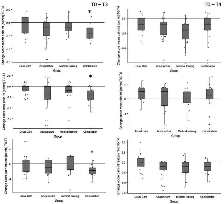
Figure 2.
Box plots of the pain intensity change scores (differences) from baseline to 3-month follow-up (T0–T3) and to 6-month follow-up (T0–T4, sustainability). The plots include individual data (dots), medians (horizontal lines), interquartile ranges and whisker bars (90 % intervals, vertical lines). The asterisks (*) indicate a significant group difference to the usual care group (refer to Table 5).
int: intensity; max: maximal; n: number.

