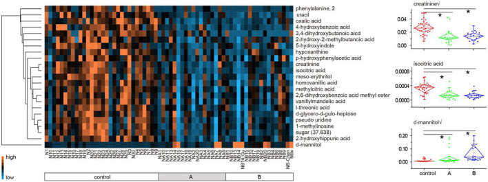
FIGURE 2.
Heat map of 23 metabolites differed between the healthy subjects and LDH patients (A plus B). Each metabolite is represented by a single row of colored boxes, and columns represent different samples. Metabolic levels are represented by different colors. The red label shows high levels in urine, while the green labels show low intensity relative to the median metabolic levels.

