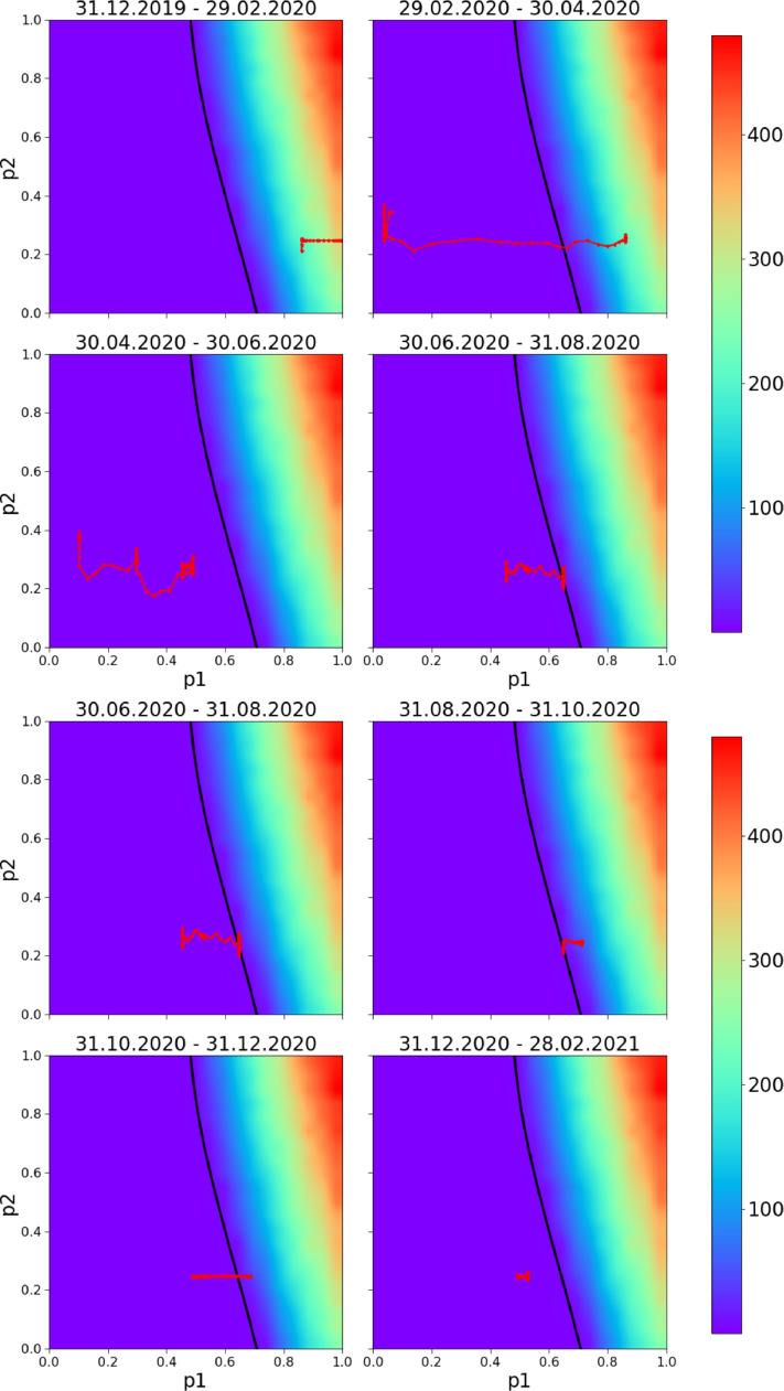
Fig. 14.
Predicting bursts. The walking line is the local-time 7 day moving averaged realisation of parameters and applying eq.(2) for fourteen month period (blue line in Fig. 12). It represents very plausible changes of the parameters and for Croatia for 2-month periods. The background variable is the expected number of COVID-19 deaths per day, the model fits very well the empirical data: the pandemic starts to grow exponentially as soon as the walker crosses the black line and enters the catastrophe zone; pandemic bursts are successfully predicted and parametrically visualized. (For interpretation of the references to colour in this figure legend, the reader is referred to the web version of this article.)

