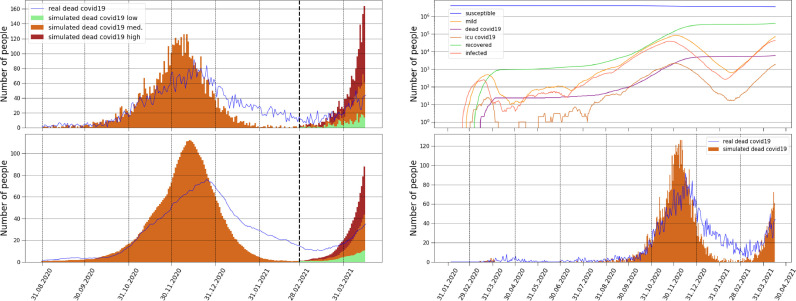
Fig. 15.
Empirical and simulated deaths. (a)-(b) Comparison of daily COVID-19 deaths between the model and the empirical results between August and April. After February three different curves are shown: in the green and least aggressive scenario the parameter found by the BO algorithm was increased by in the medium scenario by and in the red and most aggressive by . All three scenarios are generated with starting from the middle of February suggesting that the individuals probably started to follow the policies less strictly. (a) shows daily deaths data. (b) 14 day moving averaged deaths data. (c)-(d) Comparison since the outbreak in Croatia. (c) Curves represent the simulated numbers of susceptible, mild, COVID-19 dead, ICU COVID-19 patients, recovered and infected. (d) Comparison of daily COVID-19 deaths between the model and the empirical results, after February the middle curve of (a) is added. The timing of all three pandemic waves are in good agreement with the model simulation.

