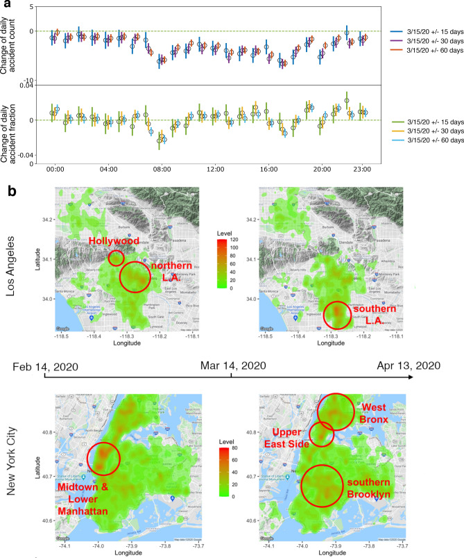
Figure 3.
Temporal and spatial shifts of accident hot spots. (a) Change of daily accident counts (top) and fractions (bottom) grouped by different hours of a day in NYC. 95% confidence intervals are shown as vertical bars for each data point. Also shown are estimates from three time windows: 15 days (blue and green), 30 days (purple and orange), and 60 days (red and cyan) before and after the mobility change-point. (b) Heatmap of traffic accidents in LA (top) and NYC (bottom) between Feb. 14, 2020 and Apr. 13, 2020, using Mar. 15 2020 as the mobility change-point. The maps are produced by R package ggmap 3.0.0 (github.com/dkahle/ggmap) and Google Map service (cloud.google.com/maps-platform/).

