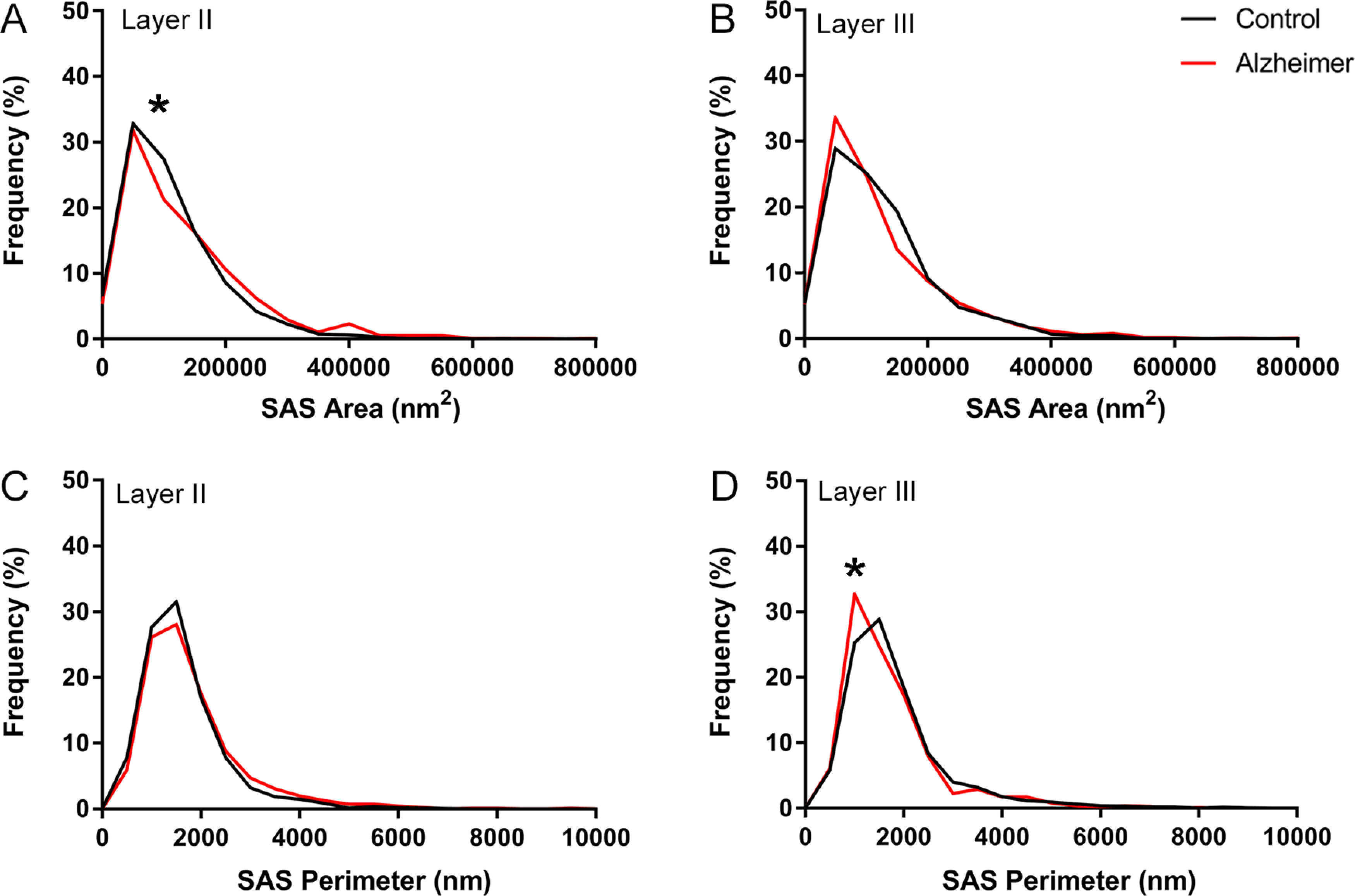
Figure 8.

Graph showing the frequency distribution plots of AS SAS area (A, B) and perimeter (C, D), in Layers II and III of the EC in control subjects (black) and AD cases (red). Statistical comparisons between groups showed significant differences (KS, p < 0.0001; indicated with an asterisk) in the frequency distributions of SAS area in Layer II (A), and in the frequency distribution of SAS perimeter in Layer III (D).
