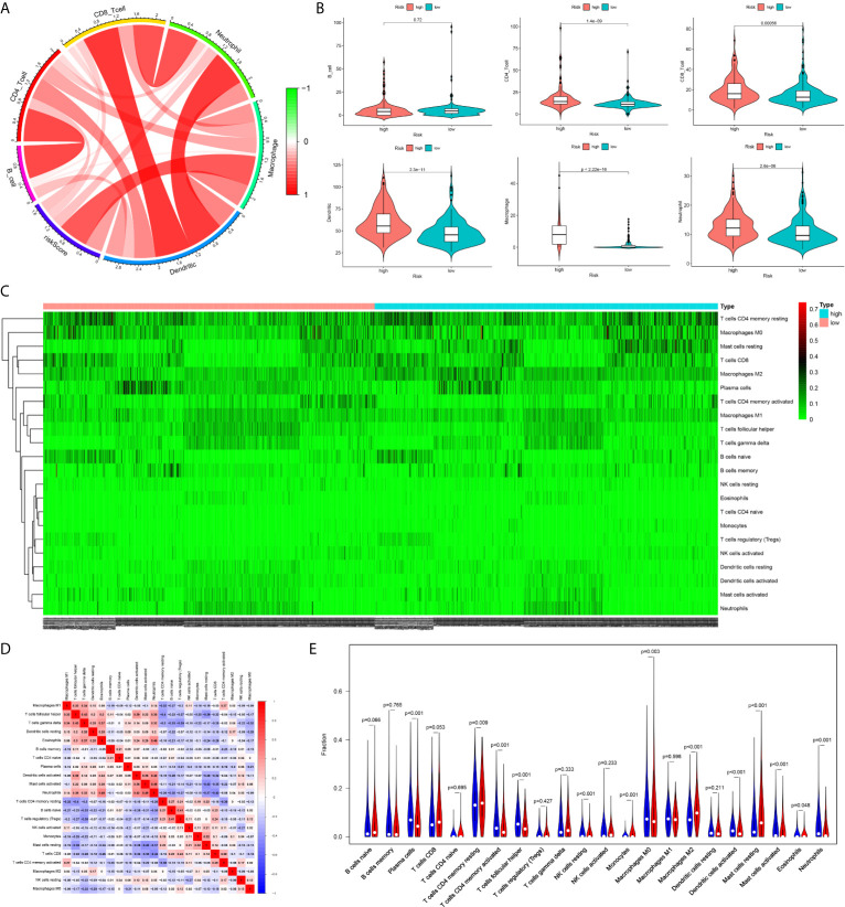
Figure 8.
The difference of immune cell infiltration between high- and low-risk groups. (A) The circos plot of risk score and the infiltration of six types of immune cells. (B) The vioplot showed the difference of the abundances of six immune infiltrates (TIMER algorithm) between high- and low risk groups in the TCGA cohort. (C) The heatmap of 22 kinds of immune cells infiltration. (D) The corHeatmap of 22 kinds of immune cells infiltration. (E) The vioplot showed the difference of the abundances of 22 types of immune cells infiltrates between high- and low risk groups[CIBERSORT algorithm, red represent high risk(n=527), blue represent low risk(n=509)].

