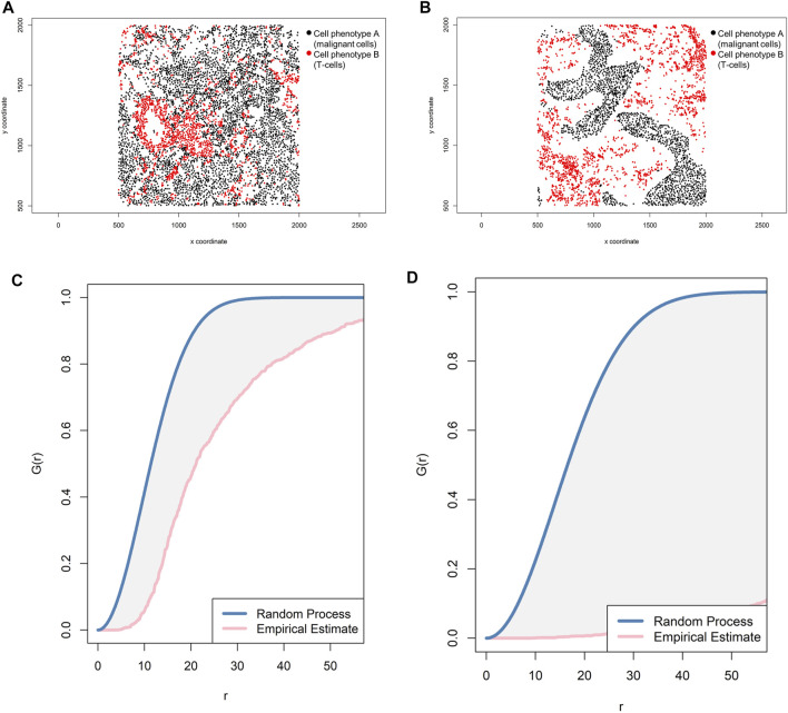
FIGURE 9.
Representative graphs showing the G-function [G(r)] curve of point pattern distributions for cell phenotype A (malignant cells) to cell phenotype B (T-cells) in a representative multiplex immunofluorescence image of lung adenocarcinoma. (A) Random point pattern distribution of cell phenotype A and B. (C) Graphic representation of the image shown in A using the cross-G-function, showing the proximity of the G(r) curve to the theoretical estimate curve (Poisson curve), characterizing a random or mixed cell distribution pattern of one cell population in relation to another cell population. (B) Unmixed point pattern distribution of cell phenotype A and B. (D) Graphic representation of the image shown in B using the cross-G-function, showing the increased distance of the G(r) curve from the theoretical estimate curve (Poisson curve), characterizing a clustering or unmixed cell distribution pattern of one cell population in relation to another cell population. The graphics were generated using R studio software version 3.6.1.

