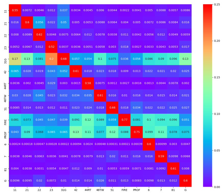
Figure A3.
Visualization of the U.S. inter-industry network. Each cell is represented by its weight in the column sum in which it is located. For instance, the first entry of row 31G shows that the output of manufacturing (31G) constitutes 17% of the Agriculture, Forestry, and Fisheries (11) total inputs. We can see that the diagonal entries have the largest weights, implying that an industry’s self-input is the largest component of its total input.

