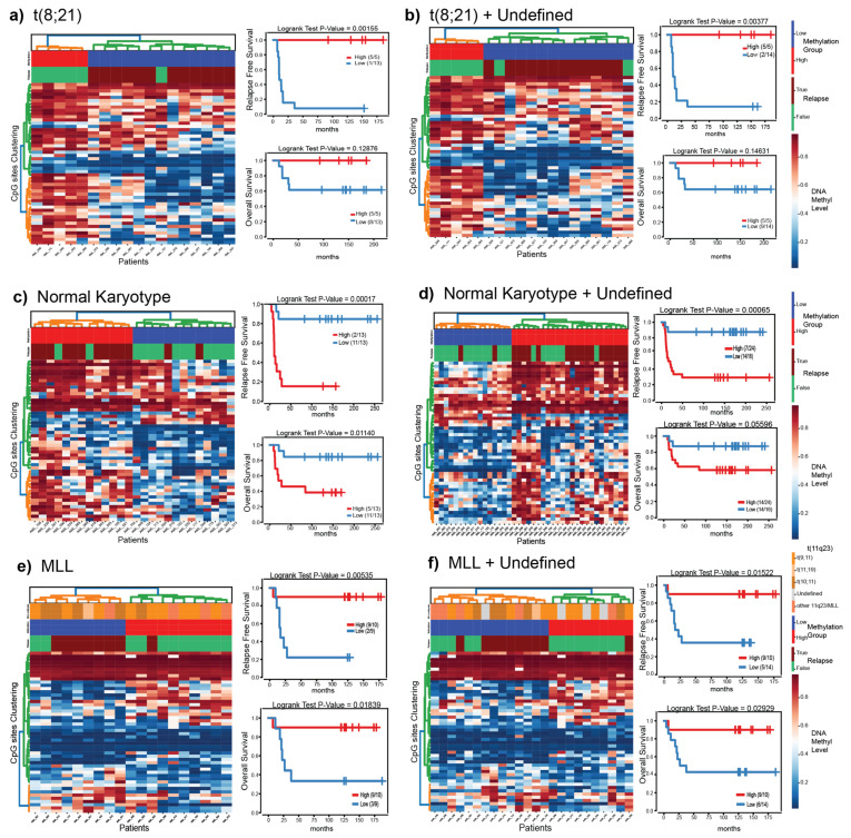
Figure 4.
Survival analysis for t(8;21)/RUNX1-RUNX1T1 (a,b), NK (c,d), and MLL/KMT2A-rearranged (e,f) patient samples based on the 50 most significant CpGs that separate the diagnostic samples of patients who later went on to relapse from those who did not. Panels (a,c,e) contain patients with a confirmed diagnostic subtype (diagnostic-known). Panels (b,d,f) contain diagnostic-known in addition DNA methylation predicted samples from the undefined group. In each panel, the heatmap (left), is ordered by hierarchical clustering. Samples along the x-axis are split into two groups color coded by high (red) or low (blue) overall methylation level. The numbers in the legend represent the fraction of patients who did not experience an event. Kaplan–Meier curve for relapse free survival analysis (upper right) and overall survival (lower right) of the two groups identified by clustering. The x-axis represents the time until event (months) and events are plotted on the y-axis.

