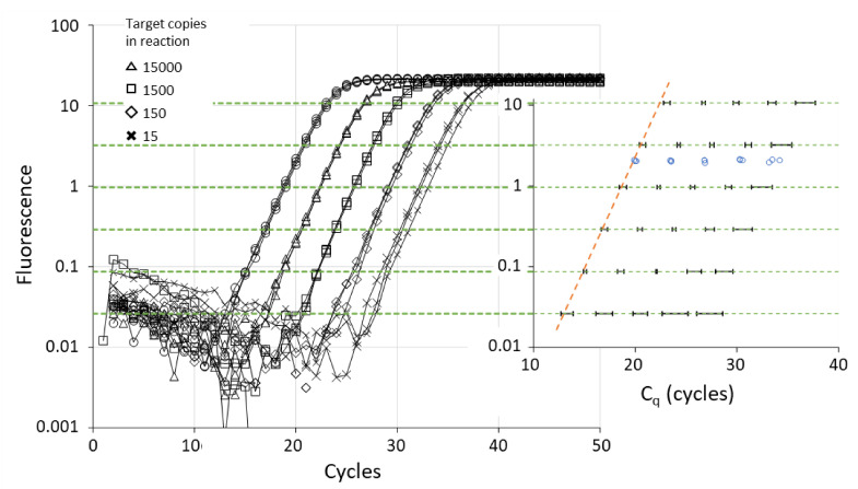
Figure 4.
Illustration of relation between threshold level, Cq value and Cq variability. The graph shows the amplification curves of triplicate measurements of a 5-step, 10-fold dilution series. Quantification thresholds (dotted green lines) were placed at six levels between the ground phase noise and the plateau phase. For each of the amplification curves the Cq value was determined. The graph in the inset shows the 95% confidence interval of the observed Cq values (mean +/− 2 × SD per dilution). The orange dotted line illustrates that when the threshold is set above the exponential phase, the Cq values are higher than expected. The blue dots are the Cq values determined from the SDM (see Section 6.2). The graph is based on actual amplification data.

