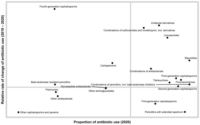
Figure 1.
A quadrant chart showing the distribution of antibiotic classes according to rate of change of antibiotic use (2019–2020) and the proportion of antibiotic use in 2020. This chart enables a relative comparison of both antimicrobial levels and trends. We can consider the antimicrobials in the lower right quadrant as widely dispensed but at a lower rate than the previous year. We can consider the upper right quadrant as widely dispensed but at a higher rate than the previous year. The upper right quadrant contains antimicrobials that are candidates for further evaluation.

