Figure 2.
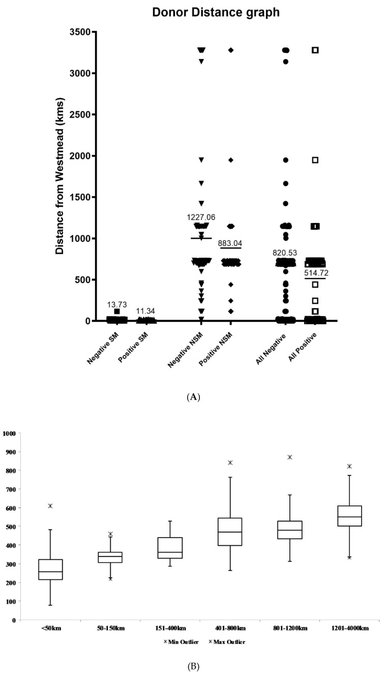
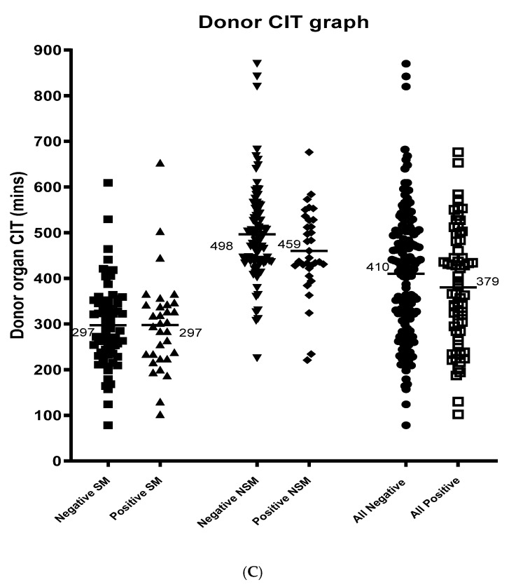
(A). Scatter plot of donor distance outcomes. Distance from Westmead (NPTU) in kilometers is shown for each analysis group, and the mean of each group is marked and labelled. Negative local (■ n = 65), positive local (▲ n = 30), negative non-local (▼ n = 129), positive non-local (◆ n = 41), all negative (● n = 194), all positive (☐ n= 71). (B). Box plot of donor distance zone vs. CIT. The CIT is shown for each distance zone, and outliers are represented by 🞶 on the graph. <50 km n = 71, 50–150 km n = 12, 151–400 km n = 9, 401–800 km n = 76, 801–1200 km n = 31, 1201–4000 n = 17. From local (zone 1) to zone 2, the mean CIT increases from 279.6 to 337.6 min which was statistically different (p = 0.03). There was no significant difference in the mean CIT from zone 2 to zone 3 (385.1 min) (p = 0.182), from zone 3 to zone 4 (474.8 min) (p = 0.009) and from zone 4 to zone 5 (504.9 min) (p = 0.171) (each zone representing a distance of 250 to 400 km). There was also a significant increase in CIT when a donor pancreas was received from zone 6 compared to zone 5 (p = 0.109), as zone 6 represents a distance of 2800 km further than zone 5 (mean CIT 560.6 min). (C). Scatter plot of CIT Outcomes. CIT in minutes is shown for each analysis group, the mean of each group is marked and labelled. Negative local (■ n = 67), positive local (▲ n = 32), negative non-local (▼ n = 86), positive non-local (◆ n = 33), all negative (● n = 153), all positive (☐ n = 65). CIT was statistically significant between local and non-local groups (p < 0.01).


