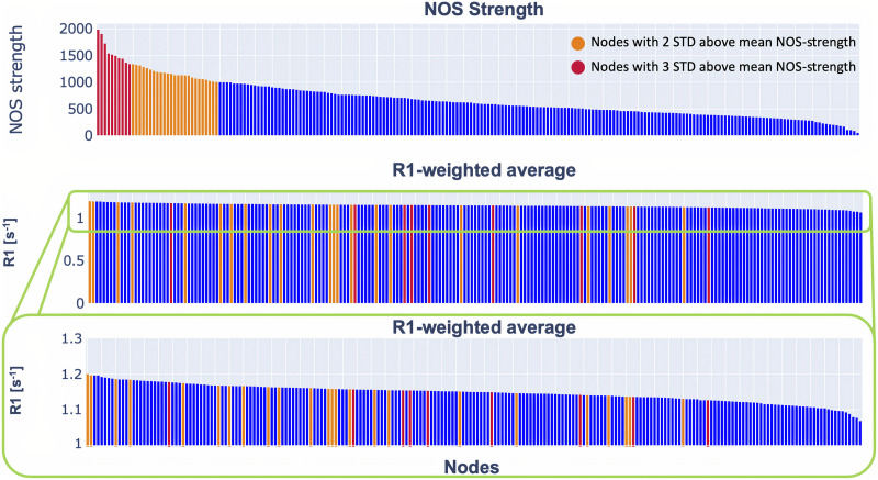
Figure 2. .
Distribution of the NOS strength and R1-weighted average. The plot in the middle shows the distribution of the R1-weighted average on a scale from 0 to 1.2. To make it easier to see the trend, we showed the same data on a scale from 1 to 1.2 (bottom plot). In orange are highlighted the nodes that are 2 standard deviations above the mean NOS strength, while in red are highlighted the nodes that are 3 standard deviations above the NOS strength. The details about the nodes are provided in the Supporting Information.

