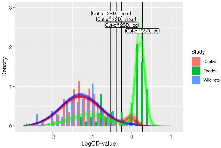
Figure 3.
Fit of the binary mixture model (curves) to the ELISA logOD values (histograms). Each curve is plotted using a random draw () from the joint uncertainty distributions of the parameters in Table 2. Hence, the collection of curves gives an impression of the overall uncertainty in the model prediction. The color of the curves indicates the study. The four cut-off values are shown as vertical lines.

