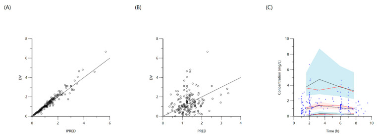
Figure 7.
Goodness-of-fit plots for final population models of ethambutol. Plot (A) represents individual predicted concentrations (IPRED) versus observed concentrations (DV), whereas plot (B) represents population predicted concentrations (PRED) versus observed concentrations (DV). Plot (C), visual predictive check (VPC) for concentrations of ethambutol versus time based on 1000 Monte Carlo simulations. Blue circles represent observed ethambutol concentrations, solid red lines represent the 5th, 50th and 95th percentiles of the observed concentrations, solid black lines represent the 5th, 50th and 95th percentiles of the simulated concentrations, and the shaded areas represent the 90% CI of the 5th, 50th and 95th percentiles of the simulated concentrations.

