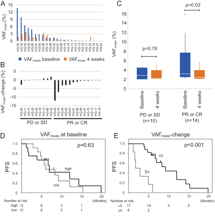
Fig. 3.
VAFmean kinetics during the 4-week LEN treatment. A The distribution of VAFmean. Blue bars and red bars indicate VAFmean at baseline and at 4 weeks, respectively. B The distribution of VAFmean-change. C Boxplot showing VAFmean at baseline (blue) and at 4 weeks (red) according to the first objective response at 6 weeks. A paired t test was used for the comparison between the VAF at baseline and at 4 weeks. D Kaplan–Meier curve estimates of PFS according to VAFmean at baseline. E Kaplan–Meier curve estimates of PFS according to VAFmean-change

