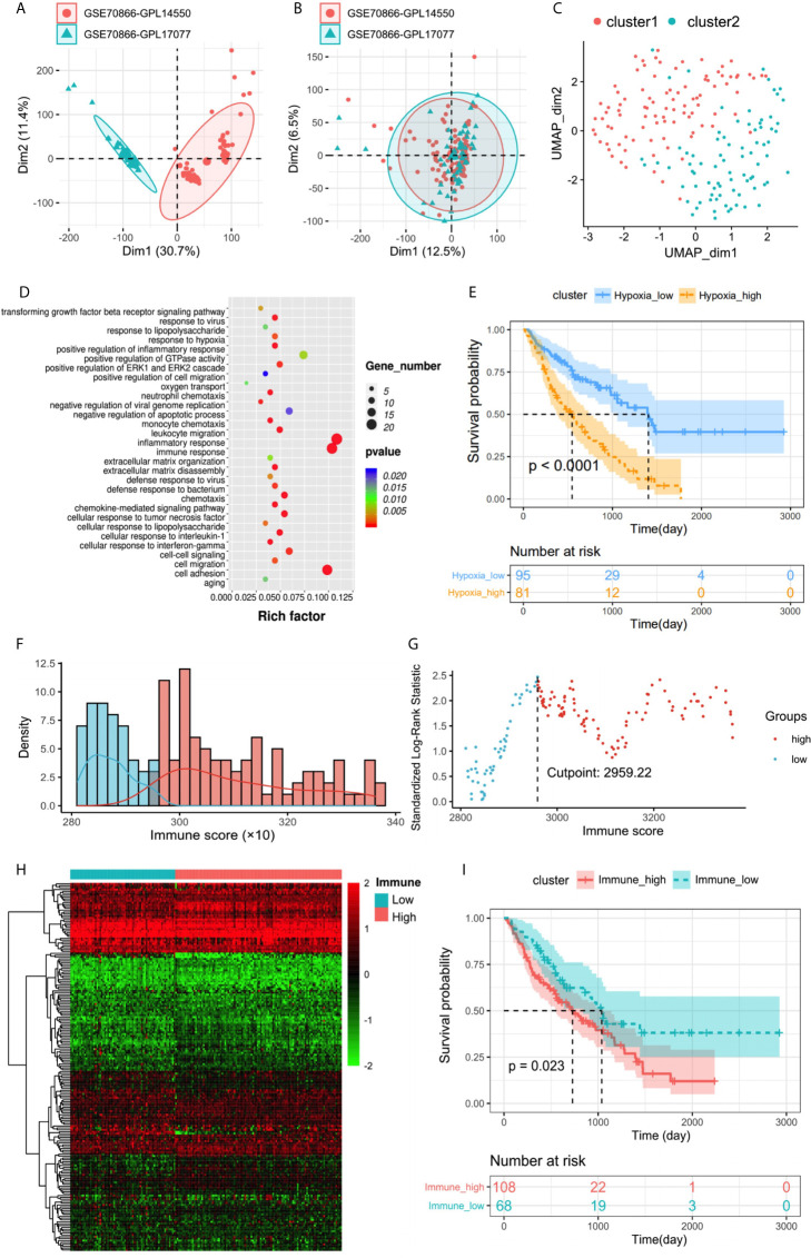
Figure 2.
(A, B) Eliminating the batch effect between different sequencing platforms. (A) The PCA plot before elimination of batch effect, and (B) is the PCA plot after elimination. The distance of sample point clusters indicates that they come from different batches and sequencing platforms. While in B, after eliminating the batch effect, the difference in distance between batches is reduced. (C) UMAP clustering plot based on marker gene set of hypoxia. (D) Biological process functional enrichment analysis of differentially expressed genes between hypoxiahigh and hypoxialow groups. (E) Kaplan–Meier plot of overall survival in two clusters. (F) Histogram based on maximally selected rank grouping. (G) The cut-off point with the maximum standard log-rank statistic was marked with a vertical dashed line. (H) The differential gene expression profiles between hypoxiahigh and hypoxialow groups were visualized in heatmap. (I) Kaplan–Meier plot of overall survival between immunehigh and immunelow groups.

