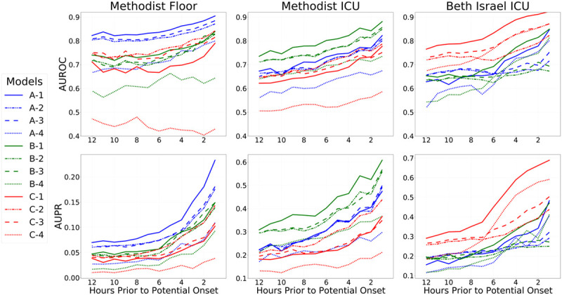
Figure 1.

Results on all three cohorts, as a function of hours in advance of potential vasopressor onset. Models were trained to predict potential onset each hour from 1 hr in advance, up until 12 hr in advance, and models were evaluated in the same fashion (i.e., each 4-hr model was then evaluated internally and externally at 4 hr in advance across datasets). Top row shows areas under the receiver operating characteristic curve curves (AUROCs, also known as C-statistics), and the bottom row shows areas under the precision-recall (AUPR) curves as metrics assessing overall discrimination. Each column shows the performance of all fitted models on one cohort: Methodist floor (left), Methodist ICU (center), and Beth Israel ICU (right). Results within a column for models trained on that data source are in-sample results measuring internal validity, whereas results for models learned from other data sources are out-of-sample and measure external validity. For each evaluation data source, results on 12 different models are shown. Models with a name beginning with “A” were fit from the Methodist floor data and appear in blue throughout. Models with a name beginning with “B” were fit from the Methodist ICU data and appear in green throughout. Models with a name beginning with “C” were fit from the Beth Israel ICU data and appear in red throughout. Models with a name ending in “−1” are the combined models that use both physiologic and measurement indicator variables, both when fitting models and during evaluation; their lines are solid. Models with a name ending in “−2” are the combined models that use both physiologic and measurement indicator variables during model fitting but only use physiologic variables during evaluation; their lines are dashed-dotted. Models with a name ending in “−3” are the models solely using physiologic variables; their lines are dashed. Models with a name ending in “−4” are the models solely using the measurement indicator variables; their lines are dotted. An important finding in the figure is that models learned on a data source always perform better in-sample on that data source when compared with models learned from other data sources; this is seen by the clustering of blue, green, and red lines at the top of each relevant pane. Another key finding is that the combined models (solid lines) always perform best in-sample but not out-of-sample.
