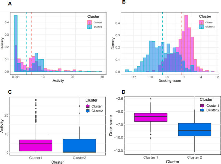
Figure 5.
Distribution of active values and Glide scores of Cluster 1 and 2 active datasets. Histograms for (A) active values, (B) SP GlideScore distributions. The dotted lines represent mean values and the histogram bar of the Cluster 1 active set, and the Cluster 2 active set are colored magenta and blue, respectively, whereas the dark blue represents their overlap region. Boxplots for (C) activity values, (D) SP GlideScore distributions of active dataset for each the Cluster 1 and 2. The magenta and blue colors correspond to the active sets of Clusters 1 and 2, respectively.

