
Fig. 3.
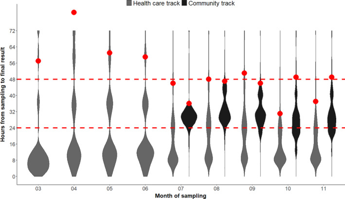
Distributions of turnaround times in hours. For the Health care track, turnaround times are shown for 1,936,468 samples analyzed at the regional clinical microbiology laboratories from March to November 2020. For the Community track, turnaround times are shown for 2,907,660 samples analyzed at TestCenter Denmark from July to November. The red points are the 95% quantiles. The plot is a so‐called violinplot showing the density distribution of the turnaround times (the areas are normalized to the same size). Samples with turnaround times below 4 h are due to point of care testing.