
Figure 3.
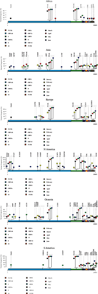
Lollipop plots showing the distribution of nonsynonymous hotspot mutations on the SARS-CoV-2 genome and the change of mutation frequencies over time within geographical locations. The presence of a mutation is shown on the x-axis (lollipop), and the frequency of mutations is shown on the y-axis vertical line. The period of genome collection is distinguished by color. Nucleotide coordinates are according to the SARS-CoV-2 reference genome. Amino acid positions are according to the mature peptides in the SARS-CoV-2 reference genome. Only nonsynonymous mutations with frequencies ≥ 10% are presented here.