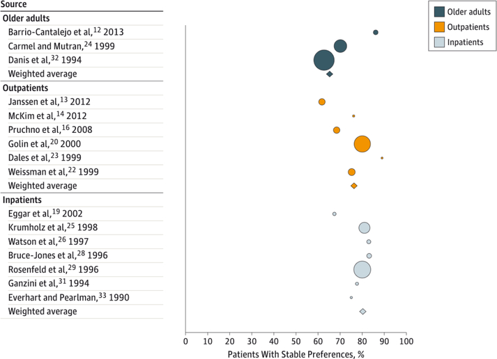
Figure 2. Percentage of Patients With Stable Preferences by Severity of Illness.
Studies were grouped into 3 categories based on the severity of illness of the source population: inpatients, outpatients, and older adults. Bubble size reflects the sample size of the study. Bubble color represents the source population. The diamonds represent a summary measure for each of the 3 groups. (The remaining 31 studies did not contain sufficient data to extract or calculate the percentage of individuals with stable preferences for specific treatment or the percentage of total stable preferences over time.)

