
FIGURE 4.
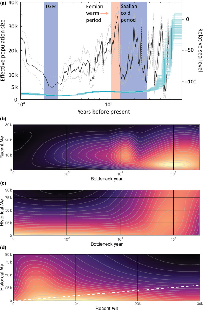
Changes in vaquita population size over time. (a) Changes in effective population size (Ne, blue, left axis) of the vaquita over time inferred from PSMC analysis of the nuclear genome. The darker blue line represents the median and lighter lines represent the 100 bootstrap replicates. The black line shows relative sea level (right axis, compared to present) with 95% confidence intervals (grey dashed lines) from Grant et al. (2014), and shading corresponds to cold and warm periods. (b–d) Heatmap of the distribution of the negative log‐likelihood (‐logL) of the empirical heterozygosity distribution across pairs of demographic parameters from the coalescent model, with higher likelihood combinations shown by lighter colour. The dashed white line in (d) represents a 1:1 slope, where current and historical population sizes would have been equal before and after the modelled change in population size