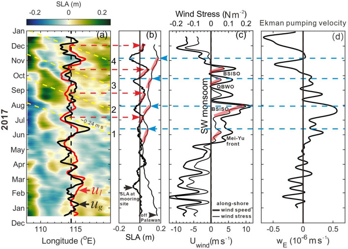
Figure 3.
Satellite SLA and wind variation near the ADCP mooring. (a) Time versus longitude variation of the satellite SLA at 10.5° N. Black dashed line marks the longitude of the ADCP; red and black curves represent ul and satellite altimeter data derived geostrophic velocity ug (without scale), which are positive (negative) on the right (left) relative to the black dashed line. Yellow dashed lines indicate the westward-propagating SLA signals for four events marked by 1–4 on the right of the panel. (b) SLA near the mooring site (thick curve) and the area-averaged SLA (thin curve) in the polygon area enclosed by the red dashed lines off Palawan in Fig. 1a. (c) The low-pass-filtered, area-averaged alongshore CCMP wind speed (thick curve) and associated wind stress (thin curve). Red and blue dashed lines indicate timing of positive peak SLA near the mooring site and off the west coast of Palawan, respectively. Transparent red lines indicate rising stages of SLA in (b), and strengthening period of wind stress in (c) due to the four southwesterly monsoon oscillations marked in (c) where QBWO stands for quasi-biweekly oscillations. (d) The area-averaged, 8.33-day low-pass-filtered Ekman pumping velocity .

