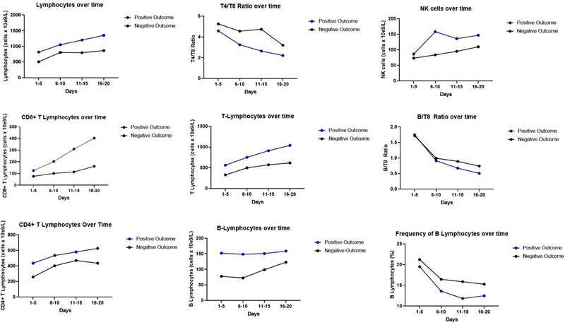
Figure 3.

Comparisons of parameters per outcome over time until day 20. Graphs show cell counts or cell frequencies in four different time points for two subgroups of the ICU COVID+ cohort. Blue dots are means of the subgroup with positive outcome (survival) (N = 16) and black dots are means of the subgroup with negative outcome (death) (N = 8). Comparisons made using mixed effect model showed no significant differences between curves. A statistically significant interaction of cell count and outcome was verified for lymphocytes, T lymphocytes, and CD8+ lymphocytes.
