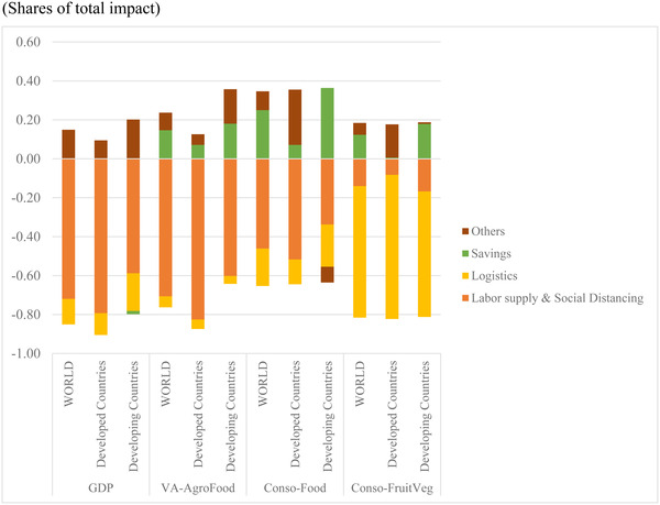
FIGURE 5.

Decomposition of the simulated macroeconomic impacts by main transmission channel [Color figure can be viewed at wileyonlinelibrary.com]
Source: MIRAGRODEP simulations results (April 2020 scenario). Note: Each bar in the graph represents 100% of the change in each variable in the COVID‐19 scenario and shows for each driver's positive or negative contribution (in percentage shares) to the overall change.
